Some places I've worked for
Anterior
Next
 Before we begin discussing about this project, my purpose as a Product Designer was to contribute to improve the efficiency in Brazil’s Unified Health System (Sistema Único de Saúde or SUS) by providing a unified and accessible platform for quick access to health information, scheduling clinical procedures, and maintaining medical records for all Brazilians. This project went through various phases, and throughout this article, I will specifically address the construction phase of the Conecte SUS Super-App. This phase received contributions from various individuals in different fields, and I am very grateful for the contribution of each person who was part of the team.
The main goal of the Super-App was to make the existing application more accessible for every Brazilian citizen, simplified, and scalable for potential new functionalities without compromising usability, and to update it with the latest technological innovations.
Some feedbacks about the existing application was the primary motivator for this initiative, as we had an average rating of 2.2 out of 5 in mobile app stores. Considering the notoriety of the application, there were already reports about usability of Conecte SUS on the news.
Alongside this motivator, I structured a quantitative research study to segment the main needs and complaints of users during the application usage. The results were quite diverse, but based on the project’s objective, the main identified needs were: Lack of linearity in the user journey, Terms that were difficult to comprehend, and the instability of the application.
I also compared the current application with existing public health apps to identify gaps and opportunities, such as apps from state governments and the UK’s NHS. This benchmarking resulted in opportunities like tracking a healthy diet, pregnancy monitoring routines, and scheduling blood donations through the application.
Due to being a high-impact project, ideation needed to be thorough and validated by various medical areas and subsequently with users. Initially, to obtain a mapping of the current application, a heuristic analysis of the current app was conducted to map and understand all the flawed flows in the current version.
With all the flows mapped, I gathered data from quantitative research to assist in creating the persona, segmenting the audiences and adding their respective attributes and characteristics. The challenge at this stage was to encompass as many Brazilians as possible, who are potential Conecte SUS users, meaning representing 220 million users in 3 or 4 personas.
Conecte SUS is a collaborative application involving various areas of the Ministry of Health. Therefore, for some areas, it was necessary to conduct rounds of design sprints to assist in ideation and functionality testing.

With the concepts validated by the Stakeholders team and the medical experts from the Ministry of Health, I proceeded to create wireframes to conceptualize and bring to life all the discussed ideas. The wireframes went through various stages until the design of a wireframe to be tested with real users. The tests were conducted using a mobile phone running the prototype on Figma with the assistance of individuals in health units, shopping centers, etc.
Based on the challenges and successes identified in the user tests, we began the prototyping of the final interface for the Connect SUS Super App. The design started with mapping all areas and the user journey to address the issue of flow continuity throughout the user experience.
 And then, I began creating visual tokens for documentation of colors and contrasts, typography, and iconography to facilitate the hand-off to developers. The process involved methodologies and software, including tests with artificial intelligence that enhance user accessibility, such as contrast tests, inclusive and self-explanatory iconography, and easily readable typography.
As the next step, the basic components of an interface were defined, creating a visual pattern to be replicated throughout the design process and utilizing all the component resources available in Figma to ease future maintenance and serve as a guide for developers’ understanding.
With the basic components created, I proceeded to design screens that would be replicated throughout the process, such as pop-ups, text components, button groups, and handed over to developers. This also contributed to the standardization of visual elements.
 With the entire pre-Design System in place, the design of the app screens became more streamlined. It was planned to develop one functionality at a time, and as soon as it was ready, it was immediately validated by the stakeholders responsible for decision-making. Over a period of 3 months, the Figma prototype was completed and validated with the respective areas.

 The next change was the card’s information disposal, I’ve added the physical/virtual information on the top of Mastercard’s logo because it’s not the main information wanted to show, but it needs to be there. About the limit, it was already shown but based on good practices of Conta Simples and Nubank, I’ve presented more visually using progress bar component. The color picked was the blue towards to call the attention of the user, because that’s a important information about the card usage.
 As a good practice from my experience, the carousel is a good option to present those cards, showing a small piece of the next card to the user. But it needs to be researched in production with the user, as the business case said, the average cardholder owns up to 5 cards. Maybe in the future the ‘search option’ could be more effective.
The next, and one of my biggest changes was the options for each card. As I said in the beggining of my arcticle, if those options are attached to a card, it needs to be connected with it. As the user swipe between cards, if one card was blocked the status will be attached to the blocked card.
As a good practice from my experience, the carousel is a good option to present those cards, showing a small piece of the next card to the user. But it needs to be researched in production with the user, as the business case said, the average cardholder owns up to 5 cards. Maybe in the future the ‘search option’ could be more effective.
The next, and one of my biggest changes was the options for each card. As I said in the beggining of my arcticle, if those options are attached to a card, it needs to be connected with it. As the user swipe between cards, if one card was blocked the status will be attached to the blocked card.
 The last change was small and concerns about the accessibility and visual consistency. The profile screen menu itens has an icon for each option but the cards menu itens doesn’t, so i took an icon for each, following the visual appearence. The chosen icons was taken from a figma’s community file called “Iconhub”.
 Last, but not least, the spacement and typographic guidelines from styleguide was followed. Based on 8-point grid, all elements were spaced by 8 multiple.


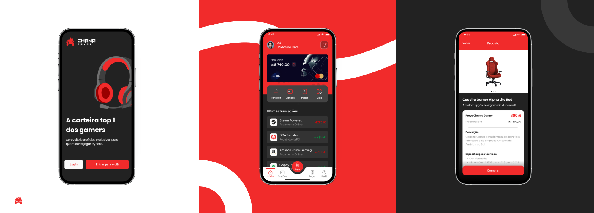
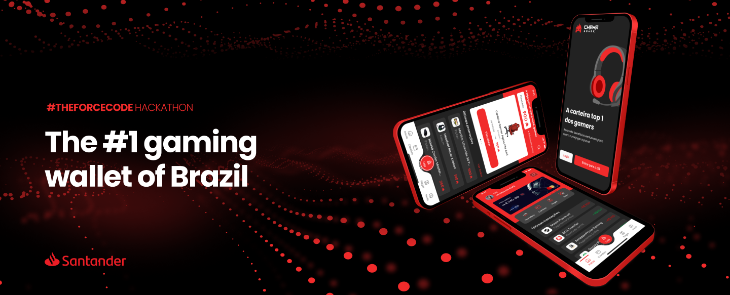
This project was a creation for the first Santander’s Hackathon, the main theme was to create a solution beyond banking. The business of ‘Chama Gamer’ is to provide the gaming community a financial app to gather every need of the user. The main feature is the ‘gaming store’, placed on the navbar’s center that is a assembly of almost every brazilian tech store and the method of payment consists on points, rewarded by credit payment.
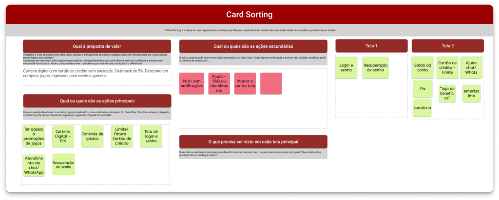
The main challenge was to create a solution ‘beyond banking’ in 48 hours. The first moment was the formation of the team, so the “Unidos do Café” was composed by 2 Business people, 2 Developers and me as a Designer. To discover the problem to be solved we made a CSD matrix and decided to follow with a gaming solution. In order to provide the best solution for gamers, the cardsorting framework was used and the main application functions was defined.
Defined the solution, the next step was the creation of persona to have a better empathy of the users. A quantitative research showed that the users has an average age between 18-28 years. The sponsor of the hackathon was Santander, and they already had a Design System called “Flame”, so prototyping became more easier. On the last 24 hours, we strive to create the prototype starting from the homescreen.
At the end, we started a round of testing with some possible users to have a feedback about the usability. The results were good, but some users missed functionalities that others bank already have. Due to the time remaining, we hadn’t the opportunity to improve any new feature. We presented a pitch about the Gaming Wallet and became finalists of the hackathon.